Care Circle Responsive Website Concept
- Andrew Walters
- Mar 25, 2021
- 6 min read

My Role: UX Researcher | Duration: 2 Weeks | Project Status: Ongoing
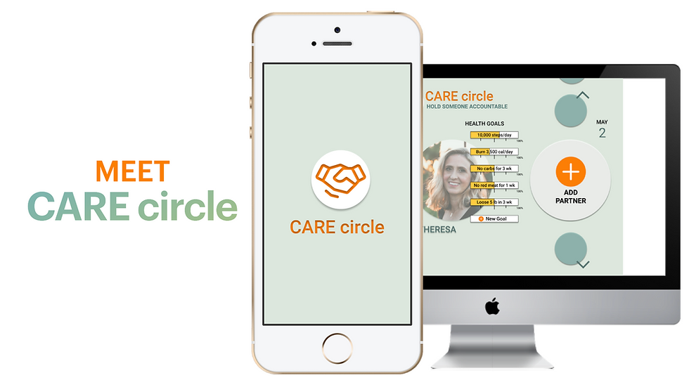
In this busy world it can be hard to stay on top of your health goals. Care Circle is a Responsive Website concept designed to give people the ability to create health goals, share them with others. The concept is to be able to add partners to your circle to track each other's goals and hold each other accountable.
The Challenge
When it comes to Health, holding each other accountable and taking care of others can be tough, yet it is incredibly important. We set out to design a service to make the experience better overall.
The Solution
We all know tracking mental health, eating habits, and fitness goals is something offered by a multitude of services. The research led to an understanding that something important was still missing; Accountability. By putting the user first and doing extensive research, we were able to design a solution. Care Circle!
The Path We Took to Get There

RESEARCH
Getting to Know People Health Habits
In this case study, we examined the problems users experience in the area of Health. We researched the problem space thoroughly to discover the most prominent need users have. The first thing we did was interview 6 users about their general heath habits.
What We Wanted to Learn • Diet Habits
• Fitness Habits
• Metal Health Habits
• Technology Habits
As UX Designers, we were tasked to do in-depth research about our problem space, gain
understanding, and retrieve information and insights through User Interviews. By conducting
these interviews, it allows us to hear, first hand, from several potential users about the topic of health. This generates rich qualitative information that we can use to validate our hypothesis and problem space.
SYNTHESIS
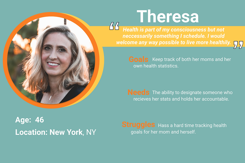
Based on data from user interviews, a Persona emerged as a cumulative identity
to guide the design process. This synthesis is a representative model of the type of person we are trying to solve a unique problem for.
What Users Had to Say • Almost all interviewees mentioned keeping a step count. They incorporated movements
throughout their busy day however they could.
• Interviewees all talked about using and having frustrations with multiple apps to diets and
fitness.
• All interviewees had positive experiences with mental health therapy. This included time to
decompress, formal counseling, prayer, oils and breathing techniques.
• A majority of our interviewees talked not only about taking care of their own health but
taking care of others.
• Users had a good understanding of their own health evolution. When younger, their goals
were focused on physical appearance. As they aged, the focus shifted to longevity and
overall mind body health.
• All interviewees had consciousness about eating to get proper nutrition from their food and for their underlying health conditions.
• Users were goal focused when creating their health routines. Oftentimes, they would focus
on one goal, see what works and adjust accordingly.
We can see from what users had to say that we need to design something that accommodates goal tracking and accountability. We should include ways to inform people of healthy foods for specific conditions, and ways to create and share routines and goals.
Their Journey
We charted out the persona’s emotional path and the corresponding actions, pain points,
opportunities, and phases as they traversed the problem space. By doing so, we, as a team,
we're able to come to a common vision of how to best improve the persona’s journey.

How They Feel
• Our target audience needs a way to track and manage her and someone else's diet and
fitness goals.
• Our target audience currently uses a large group of apps to track diet and fitness.
Theresa's journey shows us that it can get extremely complicated to keep track of her mom's health goals, let alone her own. It's important that we asses these struggles when we start to design.
CREATION
Bringing Research Into Lives
We created a map of the feature we must, should, could, and won't want to add to the design. Then we prioritized them based on which features are necessary and which features are nice to have.
Our target persona takes care of not only their own health but also that of others>> Meal sharing suggestions & reminders
Users are goal focused when creating their health routines>>Goal focused metrics
It must include ways to incentivize and motivate people with shared goals, not just compare and track>> Trending goals, competitive total body markers within circle
Incorporate movements throughout their busy day however they could>>Establishing a sense of time/routine, fitness markers
Users know that they can get proper nutrition from their food & for underlying health conditions>>Nutrition needs of multiple individuals during meal planning
Now that we know which features we are going to create we moved into design studio. This is where we sketch out what we are picturing in our head and come together on a final lo-fi mockup.


DESIGN
Presenting the Grayscale Design to Users
"Once I figured out what was what it made sense, but overall I was feeling a little confused"
From those sketches, we were able to see a general layout and have an easier time bringing these sketches into mid-fi screens and showing the users flow. This helps us test the layout and design of everything before moving into a Hi-Fi design.

How Users Felt • Users wanted to immediately click the plus button in the main navigation over the giant one on the main screen; they believe it seemed like a background instead of a clickable option. • We noticed that users were confused on who is who overall. • Users noted they would like to grab and drag items from one plate to another in the Eat page to easily add ingredients to their plate. • Many users expressed they want to use the hamburger menu to complete tasks rather than options on the screen. • Users utilized home screen to answer specific tasks, instead of individual pages we had categorized for it.
How it Preformed

Looking at our Usability Testing results we need to go back and adjust our screen in order
to facilitate success and time on task. We can do this by adding color, images and hover
states to improve the overall user experience. Being a Responsive Interface Design, it is important to also begin to design what this would look like at different screen sizes and how that would change the overall layout of all the screens. We recommend taking the working parts of the app and begin making every item clickable and link to correct overlays and screens.
Breathing Life into the Design
"I would love to be able to use this at work for my physical therapy patients!"
We brought the product to its full fledged visual design. Adding in full color, typography, imagery, refined copy and most of the functionality, we arrived at the late stages of design development. A high fidelity mobile web design adapts to the screen size of a mobile device.

How Users Felt • By visually identifying the profiles, users had an 80% success rating in adding a member to their account. This was a 167% increase from the first round of testing. Providing alternate hamburger menu pathways and clearly worded text with directions boasted the score. • Adding high resolution plate images in the meal sharing section improved the success rate to 60% which was a 20% increase from the first testing round. Hover states and colorful text and add buttons helped move the task along. • The success rating fell in the third task to 70%, a 22% decrease from the first round. The human icon might have proved confusing for a “total body” page. People often thought of it as a profile section rather than total body metric scales.
How it Preformed

After testing the hi-fidelity prototype on a new group of potential users, the results in comparison to the first, completely change for the better. All the users were able to successfully accomplish the task, regardless of how many clicks it took them to get there. Providing multiple ways of access, adding color, and rewording some buttons was the ultimate recipe for success. All in all, the users found the web browser accessible and findable.
How it's Displayed in a Browser
Being a responsive site means the content will adjust to fit the screen size in a pleasant way. This is a display of how the Mobile View translated to Desktop.

IMPLEMENTATION
Where to Go from Here
Recommended Additions & Next Steps
•Providing more food related icons or imagery in the meal sharing section could help boast the usability score even further.
• Taking a look at our last usability test, a more appropriate “fitness” icon would be in order. To ease screen transitions, the total body section needs an icon that cannot be confused as profile account.
• We look forward to providing further ways to motivate users in the fitness area. With more development time to flush out the product we would help users find common workouts appropriate to their circle’s varying health goals and conditions.
• Flushing out the trending section to expand the user’s community circle would be another future step.
• Having goal success metrics specific to health conditions would require extensively building out user input forms.
Reflecting
Care Circle can make a huge impact in the caretaking careers by providing workers with real-time tracking of their patients health goals, allowing them to remind them to reach the next goal. In conclusion, we look forward to working with the development team to take the Care circle mock-up to a real working site.
Want to experience the site first hand? Free to play around with this prototype as much as you’d like!


Comments